Discovery, Research, Brand Creative Direction, Interaction and User Experience Design, Visual Design, Rapid Prototyping, Online Platform Development
Team
Maria Calota, PM Airen Petalbert, CL PJ Sebua, SEO
Overview
Before the revamp, SenigUK’s brand and website were outdated and lacked a modern, cohesive look. The website had a high bounce rate, slow load times, and was not mobile-friendly. User engagement was low, and the conversion rate was below industry standards.
I led the end-to-end design and development direction of the brand and web experience, and played a pivotal role in defining the revamp process.
HIGHLIGHTS
An end-to-end design and build — created an experience revamp that increased and retained users.
THE PROBLEM
Outdated Brand: The Low Engagement and Conversion Crisis
A mountain of constraints.
SenigUK’s outdated brand and website caused low user engagement and poor conversion rates. Their old design and slow website performance failed to attract and retain customers, prompting a comprehensive revamp to modernise their image and improve online metrics.
A two month deadline
The team needed to address the key challenges quickly, implement strategic changes to drive impactful results on schedule
Slow loading times and poor performance
Pages take too long to load, causing frustration and leading users to abandon the site before completing their bookings.
100% Bounce Rate
Every visitor left the site immediately, signaling severe issues with content relevance or user experience that needed urgent attention
Poor User Interface Design
CTAs are unattractive and hard-to-navigate making it difficult for users to find information and complete bookings efficiently
Lack of mobile optimisation
The website is not optimised for mobile devices, resulting in a poor user experience for mobile users, who struggle with navigation and functionality.
Limited to a static website
The project faced challenges with dynamic content updates and interactivity, requiring creative solutions to enhance user engagement and functionality
Ineffective brand messaging and positioning
SenigUK struggled to resonate with its audience, necessitating a complete overhaul to clearly communicate value and enhance market impact
THE CHALLENGE
Take an otherwise highly thorough revamp and re-launch the brand to be as intuitive, friction-free, and desirable as possible.
SenigUK design principles:
Straightforward
Clear, informative, and straight-forward instructions.
Conscious
Create a mindful, impactful, and trust-worthy brand.
Product Excellence
Overdeliver with design.
THE SOLUTION
Rebirth: The Grand Comeback
Brand Revamp
With SenigUK’s rebranding journey, we transitioned from the old logo to a fresh, modern design to better align with our evolving brand vision.
The rebranding was driven by a need to modernise our visual identity and enhance brand recognition. The updated logo not only reflects our forward-thinking ethos but also ensures consistency and clarity, ultimately strengthening our market presence and appeal.
Old Logo
SenigUK’s previous logo, while nostalgic, featured outdated design elements and lacked the versatility needed for today’s digital landscape. Its intricate details often resulted in clarity issues across various platforms and sizes.
(See Figure 0.3)
Lacks Modern Appeal
Outdated design elements fail to attract contemporary audiences, making the brand seem out of touch with current trends and customer expectations.
Poor Scalability
The logo doesn't resize well, losing clarity and detail when scaled for different platforms, such as social media, websites, or printed materials.
Low Resolution
The logo appears blurry or pixelated in digital formats, reducing its professional appearance and effectiveness in representing the brand.
Inconsistent Branding
The old logo doesn't align with the current brand identity and messaging, causing confusion and a disjointed brand experience for customers.
Limited Versatility
The logo doesn't adapt well to various backgrounds and contexts, limiting its usability across different media and marketing materials.
Complex
The logo is too detailed or cluttered, making it hard to recognise and remember, especially at smaller sizes or from a distance.
Obsolete Symbolism
The logo features outdated symbols/styles that no longer resonate with the target audience, diminishing its relevance and impact.
Color Issues
The logo uses colors that are no longer relevant or appealing, affecting its visual impact and consistency with the current brand palette.
THE NEW SENIGUK
Out with the old, in with the new
New Logo
Our new logo embraces a streamlined, minimalist approach. By focusing on clean and modern typography, I’ve created a design that is both timeless and adaptable. The simplicity of the new logo ensures it performs well across all mediums, from digital screens to print, and reinforces our commitment to innovation.
(See Figure 1.0)
Simplicity
A text-only logo is clean and straightforward, making it easily recognisable and memorable.
Versatile
Easier to adapt across various mediums and sizes without losing clarity or impact.
Focus on Brand Name
Emphasises the SenigUK's brand name, ensuring it becomes the primary focus and that it is easily remembered.
Professional Look
Text-only logo is perceived as more sophisticated and professional, appealing to SenigUK's target market segment.
Consistency
Ensures uniformity across all branding materials, reducing the risk of inconsistent brand representation.
REFRESHED WEB SPACE
From Static Past to Dynamic Future
Website Redesign
Our website redesign journey marked a significant shift from an outdated static site to a dynamic, user-centric platform.
A standard set of layout grids and breakpoints (Figure 2.0), was critical in ensuring we could design and build quickly and consistently.
Clear Call To Action
The redesign of SenigUK’s website was driven by ensuring our message is clear, engaging, and actionable. The old website failed to effectively communicate our value proposition, resulting in high bounce rates and low conversions.
The primary CTA was relocated and placed consistently thoughout the pages to help bring focus to initiating an appointment booking.
(See Figure 2.1 & 2.2)
Passing the Grunt Test
The Headline and Subheadline ensure visitors understand our value immediately as they land on our Homepage.
Visible and Compelling CTAs
These CTAs use action-oriented language and contrasting colours to stand out, guiding users toward the next steps in their journey with us.
Logical Content Flow
Organised content guide users from understanding our offerings to taking action, using story-based content to maintain engagement.
High-Quality Images
Featuring real-world applications of our solutions, these visuals support our message and build credibility.
Consistent Branding
All elements align with SenigUK's new brand identity, enhancing recognition and trust.
Optimised Services Pages
Our redesigned services pages are now optimised to enhance user experience, improve SEO, and drive conversions. (See Figure 2.3)
The previous layout was cluttered and ineffective in clearly communicating the value of our services. (SeeFigure 2.4)
Finding structure amidst the chaos.
I’ve simplified the booking process on our website into three easy steps.
The users are guided by prominent CTAs that direct them to the booking page; and made sure a streamlined form ensures quick and hassle-free appointment booking.
This clarity and simplicity make it effortless for users to engage our services.
(SeeFigure 2.5)
Clear Offer
Users immediately understand our services through a concise, engaging headline. Quickly captures attention and communicates value.
Guided Navigation
Prominent CTAs direct users to the booking page. Reduces confusion and guides users seamlessly.
Streamlined Form
A simple form ensures quick and hassle-free booking. Minimises effort and maximises conversion rates.
FINAL DESIGNS
Say Hello to the new SenigUK
Finishing touches from internal team.
There were no major usability issues that came from our round of internal testing. In fact, over 98% of our internal testers had successfully received a successful booking and found the update process to be easy.
This meant that I could direct my focus on redesigning all collaterals respectively.
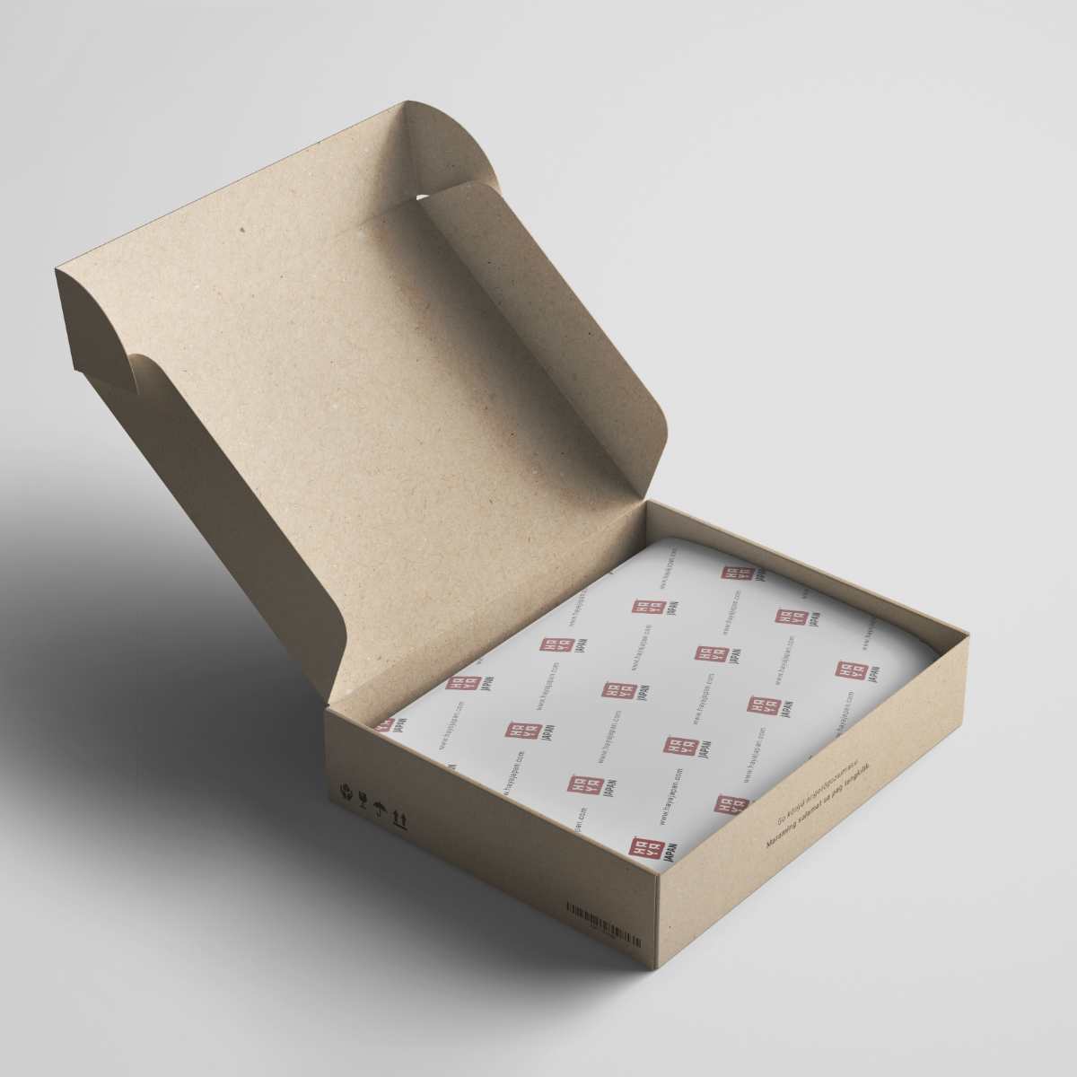
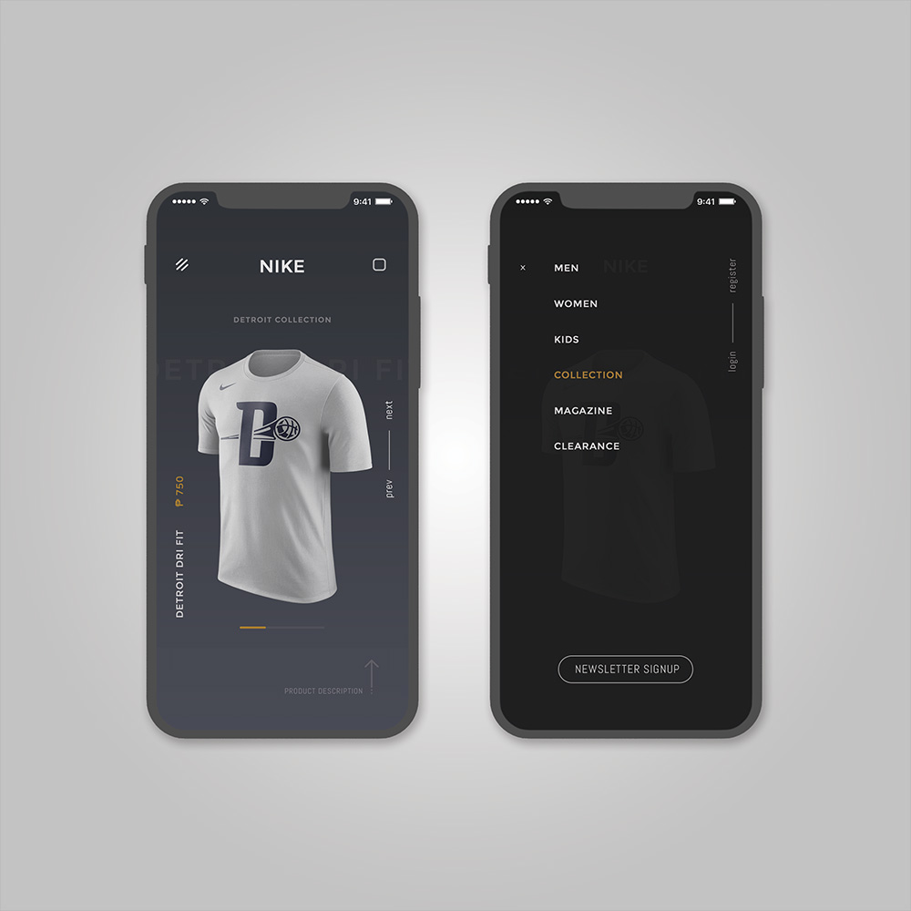
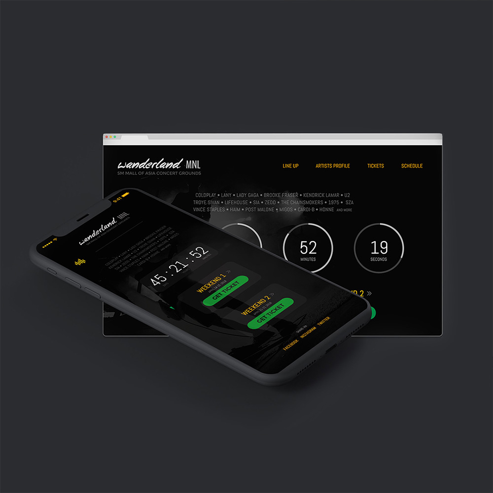
Here are some mockups I am free to share.
RETROSPECTIVE
From Obsolete to Outstanding
A HUGE SUCCESS
We saw a significant increase in user engagement and conversion rates after launch!
The sweetest victory!
The brand and website’s relaunch was met with outstanding stakeholders sentiment based from the community and publication feedbacks, alongside 1,700% increase in conversion rate.
Project Takeaways:
Finding opportunities within constraints
Viewing challenges from different perspectives helped brew new approaches to tackle other constraints.
Being resourceful
SenigUK's design resources were barely available — knowing how to create them and when to use them saved immense time and overhead.
Key stakeholders partners should be involved from the start
It ensured that the project was progressing holistically — effectively accounting for content strategy and technical feasibility early.
Simplicity was about reducing complexity, not quantity
If an added extra step led to a more intuitive and friction-less experience, it was worth the additional manual effort.